Duration
07/2025 - 03/2026
Deliverable(s)
Fully Launched Product
My Role
AI Prototyping
Usability Testing
UX/UI Design
Data Visualization Design
Collaboration
Co-Founding Team
Full Stack Engineers
"How do we design an AI-powered experience for users who want the benefits of AI—but don't fully trust AI??"
Project - When I joined the project, the MVP had already integrated AI into nearly every stage of the impact reporting process, from defining success metrics through generating PDF reports. Yet users, who are less tech savvy seniors, remained hesitant to adopt it. Poor AI-generated results had eroded trust, while fully manual workflows felt overwhelming and inefficient.
Design - As a critical component of impact reporting, data visualizations were primarily presented through conventional chart formats that often failed to communicate insights in an engaging or compelling way. At the same time, AI-generated data visualization was still an emerging concept, with few established patterns or market precedents to guide the experience.

Roles & Goals
Research & Design
Horizontally,
Analyzing AI-enabled products across adjacent industries to understand how they incorporated AI features into their ecosystems and user journeys
Vertically,
Researching traditional data visualization platforms to identify potential touchpoints where AI could add value throughout the workflow, including data parsing, chart generation, visual refinement, labeling, legend creation, or other aspects of the visualization process.

Human-in-the-Loop
Users—especially less tech-savvy and senior professionals—were willing to embrace AI only when they felt they remained in control of the outcome.
Key observations:
Users wanted visibility into the source data feeding the AI.
They expected precise editing and fine-tuning capabilities after generation.
AI-generated visualizations were viewed as starting points, not final answers.
Trust increased when users could verify, adjust, and validate the results themselves.
Takeaway: Human oversight and editability were more important than maximizing automation.
Build on Familiarity
Despite the promise of AI, users still relied on established data visualization workflows to understand and evaluate results.
Key observations:
Users wanted to see inputs, editing controls, and rendered outputs within a single integrated workspace.
Side-by-side visibility helped users assess whether a visualization accurately reflected the underlying data.
Familiar interaction patterns reduced uncertainty and increased confidence in AI-generated outputs.
Users preferred AI-enhanced workflows over entirely new paradigms.
Takeaway: Transparency and familiar workflows helped users understand, validate, and trust AI-generated visualizations.
How might we help senior users collaborate with AI in creating data visualizations without disrupting the workflows they already trust?
Solutions
Prototyping by AI
Since many senior users found it difficult to evaluate abstract AI concepts without visual references, I leveraged Figma Make, Observable AI and Claude Code to rapidly create high-fidelity, interactive prototypes that enabled more realistic usability testing and stakeholder feedback.
Testing in Chunkier Modules
Rather than relying on a fully autonomous AI workflow where a single failure could disrupt the entire experience, I decomposed the user journey into independent AI-assisted modules and tested each phase:
Testing AI for a single datapoint design;
Testing AI for every individual phase separately—from input to editing to output—separately
Prototyping 1 - Validating core components of an AI-powered data visualization
User testing validated four core components:
Data Input Workspace – A persistent data input panel that allows users to view, edit, and reference source data throughout the process;
Live Visualization Preview – A real-time rendering area that instantly reflects database and data-editing changes;
Conversational UX with Explainability – An AI chat interface generating results with reasoning, with direct links to relevant data points to help users navigate large datasets efficiently;
Bakcup Chart Types – Support for multiple visualization types, enabling users to apply and compare different chart formats using the same underlying dataset;
Protoype 1: A single data point coded with animation for usaility testing (tool: Figma Make & Claude Code
Prototyping 2 - Testing Creative Data Point Design
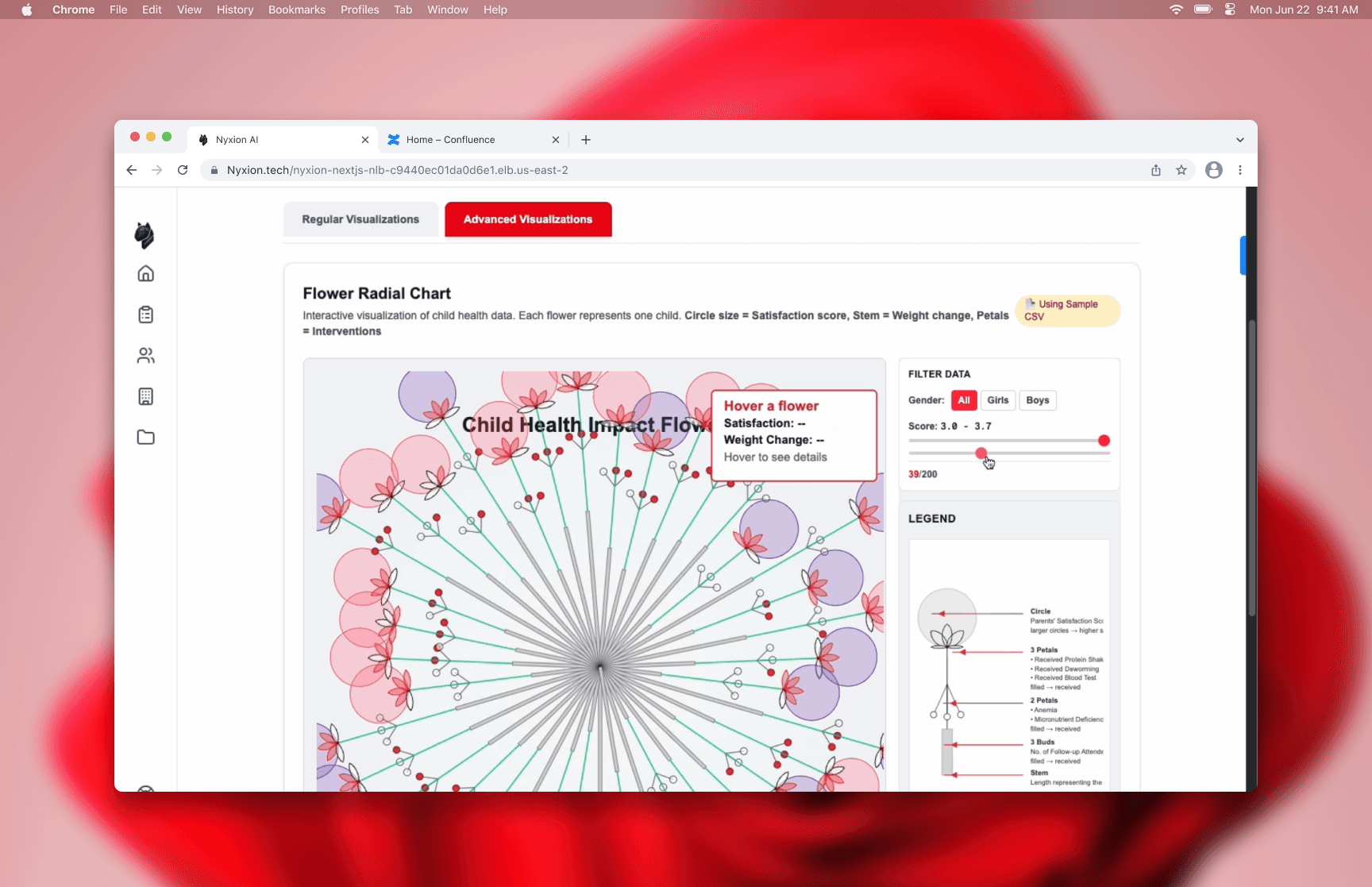
This prototype evaluated user acceptance of a multi-layered data point that combined multiple data attributes into a single visual element. It validated that:
Preference for Familiar Charts – Users favored conventional chart formats such as scatter plots, bar charts, and pie charts because they were easier to understand and required less cognitive effort.
Support for Richer Data Points – That said, participants appreciated the ability to embed multiple layers of information within a single visual marker by creative design, allowing more context alighning with content storytelling;
Questions Around Scalability – While the concept was well received, users expressed concerns about whether highly detailed data points could remain readable and effective when applied to larger, real-world datasets.
Prototype 2: A visually creative single data point integrating various data types, like integer, percentage, and numbers testing
(Tool: Observable AI)
Prototyping 3 - Integrating the Above
This prototype evaluated the overall user experience and validated that:
Balanced Familiarity and Innovation – Users responded positively to the combination of familiar chart structures and innovative data point designs, finding the experience both approachable and visually engaging;
Strong Performance at Typical Scales – The integrated solution worked well when visualizing small to medium-sized data points, maintaining both readability and information richness;
Scalability Limitations Identified – However, as data points became larger and more content-dense, some visual designs began to lose clarity, highlighting the need for setting the boundaries of inputs and outputs.
Prototype 3: UI ntegrating conventional data viz familarity and conversational UX paradigms
(Tools: Figma Make)
Prototyping 4 - Defining Data Input Boundaries
This prototype explored how setting boundaries on data inputs could improve the quality and usability of AI-generated visualizations through the introduction of scope controls:
Improved Output Quality – Narrowing the scope of data inputs resulted in faster generation times, improved accuracy, and more concise and readable visualizations.
Enhanced User Guidance – Scope controls helped users focus the system on relevant data, reducing noise and increasing the likelihood of generating meaningful insights.
Open Questions for Future Research – Further exploration is needed to determine how input boundaries should be defined, including whether parameters should be tailored to individual projects and datasets or standardized across the product experience.

Outcomes
100%
Positive Testing Feedback
Users recognized the value of combining AI assistance with interactive data visualization, reinforcing confidence in the product direction.
Contributed to Acquisition Success
The AI-powered database and visualization innovation became part of the product's value proposition, ultimately contributing to its acquisition.