Embrace
AI-Enabled Manifestation.
Help trauma survivors find their inner angel.
TL;DR
📲 Product
Industry: Healthcare & Wellbeing
Phase: 0-to-1 Product
Type: iPad & Mobile App
Status: Prototyping for VC
📽️ Project
Duration: 4 months
Type: Entrepreneurial
Team:
Project Manager
User Reseacher (😃Me)
Product Designer (😃Me)
Developer
🏋🏻♀️ My Contribution
Desktop Research
1-on-1 user research & testing (Interviews, journaling, etc.)
Rapid prototyping to test concepts
🎯 Goals
Project Goal:
Develop tools to assist trauma survivors in promoting their well-being and warding off prolonged stress.
Design Goal:
To streamline and validate innovative forms of interactions and user experience
🎉 Impacts
Successfully developed and tested five mock-up iterations.
Developed a system for custom surveys using Google Colab
I survived the challenging taboo topic, and this project was my unexpected therapy during my own brush with grief.
Project Synopsis
Introducing “Embrace”:
a cutting-edge initiative focused on digital self-help tools for trauma recovery by rewiring their brains. Highlights include:
A tailored digital bibliotherapy platform for young grief survivors.

An award-winning AI-powered platform kickstarting therapy (Recognized by MIT Creative Arts Competition and MIT Fuse Accelerator).

A daily brain-training video tool for aspirational individuals, currently being pitched to investors.
Background & Research
In a course project , me and my team were given a topic in response to the post-pandemic mental health challenges. Starting with the topic Bereavement, we find insights universally applied to various mental health challenges:
trauma never healed
We discovered many adults carry unresolved traumas from a younger age.
Atomic habits
We recognized the power of daily rituals in shaping positive mindsets.
language matters
We observed the profound impact of language on emotional self-perception.
Finding & Challenges
However, the project had its unique challenge - rapid prototyping regarding several yet-to-be-defined topics from the user experience design perspective:
Speak up?
Participants were initially reluctant to speak up due to the sensitive nature of the topics.
"self-paced"
Participants showed a noticeable preference emerged for self-paced activities over real-time interviews.
unwelcomed novelty
Preliminary prototypes sometimes baffled users because of the novelty of our ideas.
To address these, I:
Introduced take-home tasks (e.g., journaling) for flexibility;
Prioritized creating mid-fidelity prototypes for clearer communication.
Showroom - Rapid Prototyping
1.Visual Representation of Emotions
How might we nudge people to describe their emotional status and try to visualize their emotions correctly?
Reason: visualizing emotions proved to be a conundrum in historical practices: it could be pixel-perfectly detailed as well as complicated in UX design, which makes the visualization process complicated.
1.1 My solutions
To understand users' thoughts on roles of emotions in trauma healing, I suggested that we allow participants to do journaling instead of on-the-spot interviews, so that users might feel more relaxed to speak up.
1.1.1 Two digital mock-ups
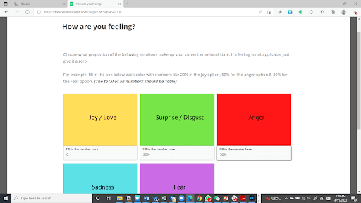
Second, digital prototypes were developed using:
Bubble (Below Right) for numerical emotion representation, prompting users with explicit questions to gauge their emotions;
Webflow version (Below Left) was more subtle, utilizing implicit cues.
Outcome: ❌ & ❌ ‼️
The Bubble version (right below) confused some due to its numeric system - people felt it hard to calculate their emotional proportions, and they intuitively feel emotions are too complicated to be categorized only into five to six genres, even though some fundamental research did so;
Webflow's version (left below) was engaging but occasionally perplexing - participants felt it hard to memorize every emotion card;
1.1.2 Coding for questionnaire
At the same time, I co-created a dynamic Google Colab model to adaptively customize emotion-related questionnaire for various users.
Outcome: ✅
The dynamic questionnaire model using Google Colab had a favorable reception, as it allowed for adaptability - participants felt more comfortable answering questions concerning emotions, especially when questions came in bulk;


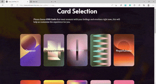
1.1.3 Physical Cart sorting
First, I introduced emotion cards allowing users to sort and prioritize feelings.
Outcome: ✅ !!
Interestingly, the traditional paper-based method resonated most with users - people could always track their selections, and the cards are always there for them to digest the content on the cards at their own pace, emphasizing the importance of tangible interactions even in a digital age.

A side note
concerning emotion recognition, I did an follow-up UX audit on several fad apps (e.g., How We Feel) featuring emotion management. Apps like "How We Feel" still rely on manual emotion selection, highlighting an evident gap in the market and a pressing need for intuitive UI paradigms.

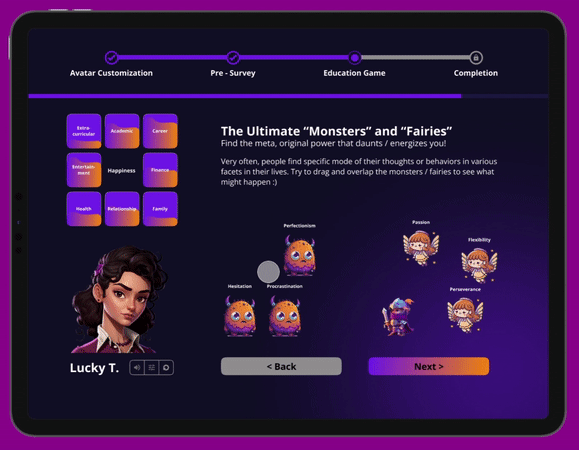
2.Discovering Inner Strengths & Weaknesses
Learning that visualizing emotion directly is complicated, I suggest pivoting to a new topic - helping people discover their inner power/fear, instead of measuring for them.
How might we visualize the process of “discovering the hidden” to help users unearth and understand their inner self?
Reason: Imagine discover the Monster or Angel - the meta power that hinders or empowers people in their daily mindsets, actions and perceptions. it requires both design sense to raise engagement as well as scientific support (i.e., why it works).
2.1 My solution
I developed a playful, gamified prototype in Figma, incorporating elements reminiscent of board games, ensuring a familiar and interactive user experience.
The game allowed users to identify, confront, and work through their personal "monsters" or challenges while also celebrating their "angels" or strengths.
Outcome: ✅
The interactive design proved enjoyable for users, though some clarity was desired. Feedback pointed towards the need for more overt cues and prompts(i.e., more hints on which cards could be dragged and overlapped, and more interaction statuses are required to instruct people for right actions), guiding the user journey without causing confusion.
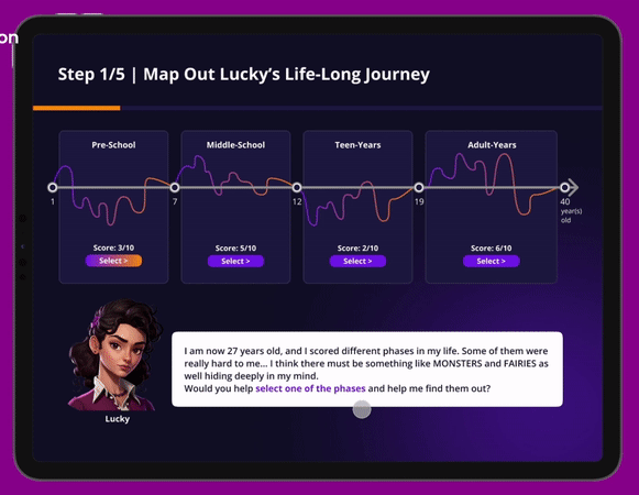
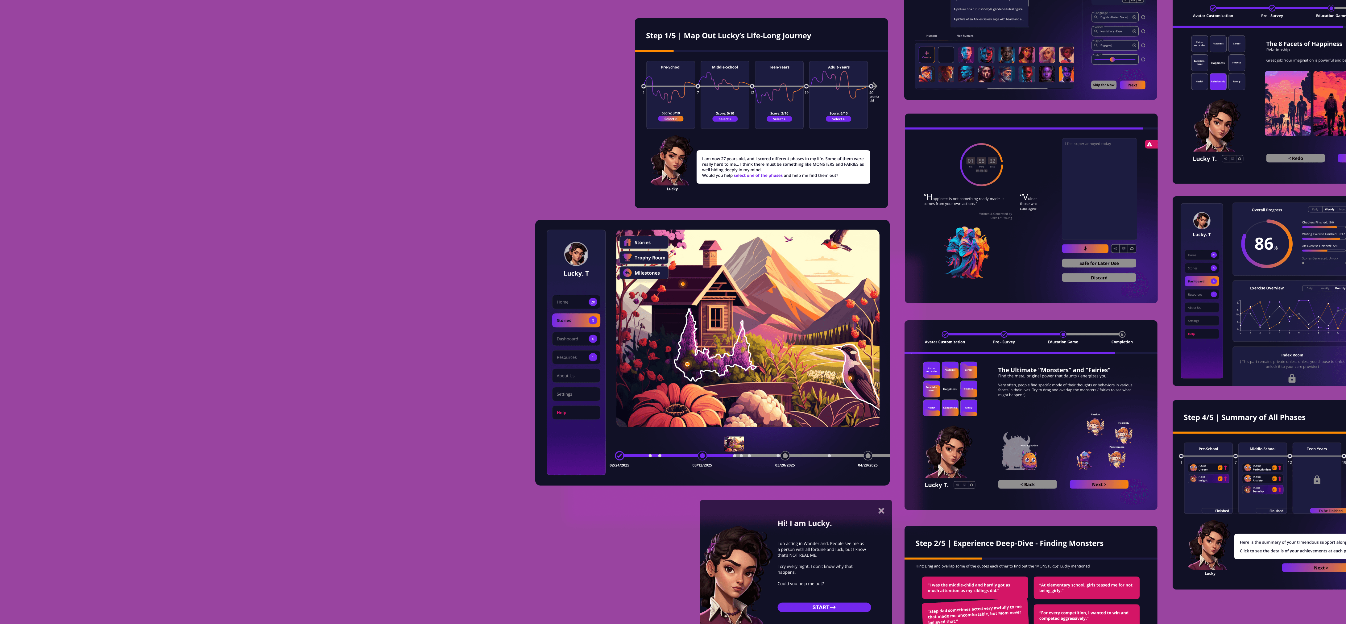
3.mapping out the journey
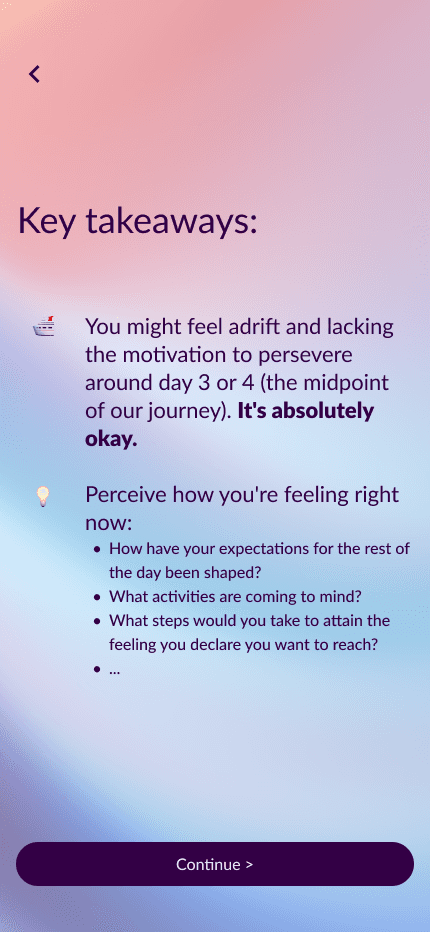
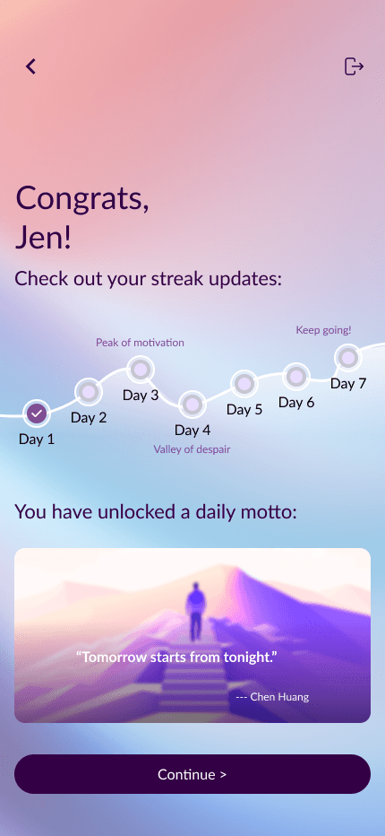
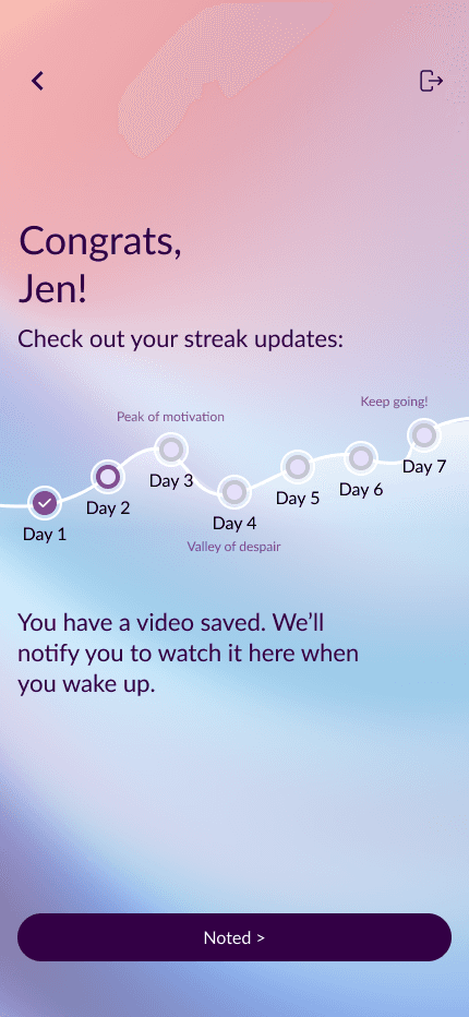
One of the biggest learnings from the second case was that envisioning a future with atomic habits in daily life is more powerful than learning from the past. Hence, me and team did another pivot - to delve into people's daily manifestation with better envision of the future.
How might we guiding users through potential obstacles and progress milestones during their first week of therapy?
Reason: in a recent concept model for “anxious dreamers” (people who have stronger aspirations and stronger level of anxiety and self-censorship simultaneously), the users were require d to record a daily and rewatch it the next day. It sounds quire simple to develop such a concept though, anxious dreamers require more clarification of the goals, roadblocks and experience before they take action.
3.1 My solution
I conceptualized the user's journey as a mountain ascent, visually representing the user's path with challenges and achievements. Peaks symbolized milestones or achievements, while valleys highlighted potential setbacks or challenges.
Outcome: ✅
The visual was well-received by both the team and potential investors, clarifying the concept of “daily videos for rewiring brains” very effectively.
Compared with graphs that purely showcase ascent or positive progress, my graphs shows real ups and downs in people's daily manifestation routine help them feel more authentic and seen.
My Learning
Months after this project, grandpa left me forever in the latest round of COIVD. This profound loss, my first intimate dance with mortality, cast a spotlight on the inescapable march of time within my family. What helped me through was the insights, that kind of positivity from the mourners I interviewed before:
"Don't stop here. Our loved ones have merely crossed a horizon, watching over and guiding us to be a better person."
I could spend pages to depict this sorrowful but rewarding experience. Long story short - learning from the hardships, I have now established daily routines to meditate, to stay positive, to take actions, to be that better person grandpa has been expecting me to be.
Practicality Over aesthetics, flexibility over fixed details!
Design is to solve problems. In terms of experience design, it's not always about digital tools. If a simple paper-based approach works, it shouldn’t be overlooked. Designers very naturally fall into wire-framing & prototyping using Figma or Adobe XD, etc, and aspire to make it close to hi-fi status. My learning is to put away pre-assumptions and stay open to any possible solutions.
Less is More.
Another myth of designers when doing prototyping is that we tend to include as much detail, and assume users will play around with great feedback. While prototypes should be comprehensive, it's essential to focus on the core elements and not overburden the user with details.